How I chose a webcomic size to use for websites and books

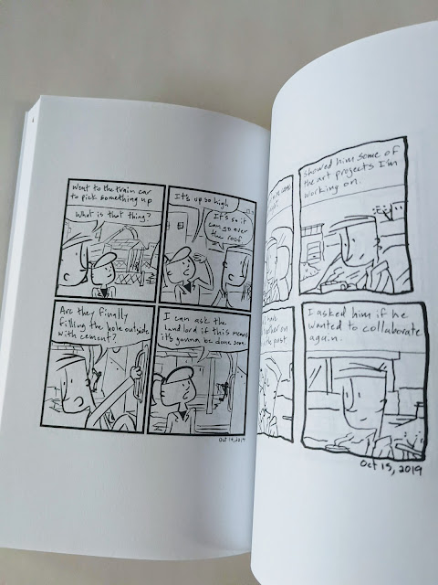
picture of webcomics in a book

How I chose one size for my webcomic that works for websites and to use in a book

Over time, my webcomic transformed into more than just something I posted on my website. It was a thing that I could find multiple uses for.

Now when I draw the comic I know that it's going to be used for a book and put on multiple media websites and webcomic sites.

I draw one thing and it's being turned into several things at once.

Right now I draw the webcomic using these dimensions:

1000px by 1200px and a dpi of 300

Here is the story of how I decided this is what the size of my webcomic should be.

(Related post: Choosing webcomic book sizes for print - How do I make my webcomic books)

When I started my webcomic I just chose a size at random

When I first started drawing the comic I was just posting it on my website. 
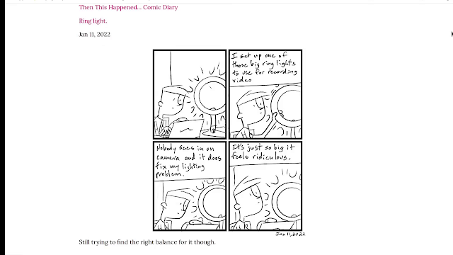
image screenshot of webpage with a comic
Screenshot of my webcomic on the site

I just picked a size for the comic that was a large rectangle like a comic page and I just went with it. No real thought behind it.

This wasn't a problem at the time. But I wasn't thinking ahead. 

I wasn't thinking about how the comic would transform to other sites and mediums.

Adjusting the sizes for each medium seemed like more work

I could adjust the size of the webcomic for each of these different platforms. But it would take extra work. It would take manipulating what I had and then creating several different versions of it.

So I decided I wanted to find a way for me that was smarter rather than harder.

I started posting to webcomics sites

I had started posting my comics to different webcomics sites. I wanted to try and put them in a place where people were actively looking for webcomics.

I could cross-post to that instead of trying to find people and bring them to my site.

Tapas webcomics

One of the first ones I started using was tapas.io.

The size requirements for tapas is 940px wide

They even offer a monetary reward system and they also share ad revenue on the site.

screenshot of a webpage
Tapas.io monetization program

I can get ad-sharing revenue if I get more people to view my comic. So that part's really cool!

Webtoons

I also post to a webcomic site called webtoons.com.

The size requirements for Webtoons is 800px wide

Webtoons also have an ad sharing program but you have to have a certain amount of followers to apply to be in it.

Webcomics on Instagram

I had also started posting my webcomic to Instagram about halfway through creating my first webcomic book.
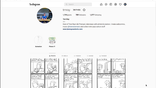
screenshot of website
My webcomics on Instagram

For the most part, Instagram likes square images. 

But I have found I can post a taller rectangle on my Instagram feed.

The tallest image I found that works in the feed is 1200px

So if I resized my webcomic the width then became 1000px

Which is the size of the comic I ended up using.

I went with the Instagram size because it was larger than the size of all the other sites. 

So now I could use my Google Photos resizing trick to adjust it for the other webcomics sites.

This size also worked out great for my webcomic books.

Check out the video

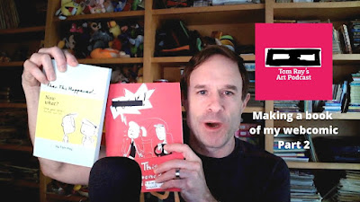
picture of a man holding paperback books

I made a video talking more about this and the whole process of making my webcomic book. You can check that out on the site here! Making a Webcomic Book on Amazon - Part 2

Listen To The Podcast

Popular

Artwork for the original Candy Land game by Milton Bradley from 1955.

I have a vintage Candy Land game from 1955 by Milton Bradley and I was about to sell it so I thought I would add it to my personal art history course concept I've been doing . I'm going to try and see if I can find out how this game was created, designed and why? Here is what I found out about this game https://candy-land.fandom.com/wiki/Candy_Land_Wiki Candy Land is a board game about children exploring a world made out of candy and other sweets that originally came out in 1949. In every version of the game, there are a group of children that go through Candy Land. In the earliest versions of the game, it was a realistically drawn boy and girl. Drawing of the Candy Land kids I did on my phone ☝ https://board-games-galore.fandom.com/wiki/Candy_Land The game was designed in 1948 by Eleanor Abbott , while she was recovering from polio in San Diego, California. It's rumored that Eleanor also did the original artwork but I didn't find anything that

To Do: Multitasking My Business, Music, and Comics

Sometimes balancing my multiple projects can often feel like an overwhelming task. I sit and think out loud about the tasks I need to juggle this week from my vintage reselling business, my band, and my webcomic series. In this video vlog, I begin the week by prioritizing tasks and setting goals. I'm going to mark them as I go along. ✅ = Done ⏲ = Still waiting Vintage reselling business - The Pop Culture Roadshow With a vintage reselling business to run, the first order of business is to pack orders from weekend sales on platforms like eBay and Mercari.  As I pack these items I need to record a 'What Sold' video for my Pop Culture roadshow YouTube channel , turning the task into video content. ✅ Pack orders ✅ List new items I got from estate sales (See my latest eBay store listings here ) ⛔ Create a new "What sold" video for my YouTube page (Recorded not edited - Laptop upgrade issues) Band - Lorenzo's Music I've also got a new song out this month so I nee

A quick peek behind-the-scenes of a new webcomic series. Coming soon!

I've recently paused my usual diary comic to dedicate my attention to an exciting new project—a fiction webcomic series featuring two characters that may be familiar to my long-time followers.  These characters, Bobert and the Monster have made appearances on my website before , and now they're taking center stage.  I'm working diligently with the hope of launching the series shortly.  In the meantime, I'd like to share this behind-the-scenes video of the drawing process for one of the upcoming pages.  Stay tuned for more updates as I bring this creative vision to life.

New song! Variation witch

Keeping up with my plan to release new music every month.  This time around I venture into the punk blues realm. Sort of a mixture of The Black Keys and The Eels . This is a song called "Variation witch" by my band Lorenzo's Music .  The cover art is actually an antique top that I have in my collection. What I liked about it was the striped disc kind of like something in a Tim Burton film.